Advanced Tutorial#
This is the legacy version of the advanced tutorial. We recommend you to read the newer (current) version because it is easier.
Adding visualization#
So far, we’ve built a model, run it, and analyzed some output afterwards. However, one of the advantages of agent-based models is that we can often watch them run step by step, potentially spotting unexpected patterns, behaviors or bugs, or developing new intuitions, hypotheses, or insights. Other times, watching a model run can explain it to an unfamiliar audience better than static explanations. Like many ABM frameworks, Mesa allows you to create an interactive visualization of the model. In this section we’ll walk through creating a visualization using built-in components, and (for advanced users) how to create a new visualization element.
Note for Jupyter users: Due to conflicts with the tornado server Mesa uses and Jupyter, the interactive browser of your model will load but likely not work. This will require you to use run the code from .py files. The Mesa development team is working to develop a Jupyter compatible interface.
First, a quick explanation of how Mesa’s interactive visualization works. Visualization is done in a browser window, using JavaScript to draw the different things being visualized at each step of the model. To do this, Mesa launches a small web server, which runs the model, turns each step into a JSON object (essentially, structured plain text) and sends those steps to the browser.
A visualization is built up of a few different modules: for example, a module for drawing agents on a grid, and another one for drawing a chart of some variable. Each module has a Python part, which runs on the server and turns a model state into JSON data; and a JavaScript side, which takes that JSON data and draws it in the browser window. Mesa comes with a few modules built in, and let you add your own as well.
Grid Visualization#
To start with, let’s have a visualization where we can watch the agents moving around the grid. For this, you will need to put your model code in a separate Python source file. For now, let us use the MoneyModel created in the Introductory Tutorial saved to MoneyModel.py file provided.
Next, in a new source file (e.g. MoneyModel_Viz.py) include the code shown in the following cells to run and avoid Jupyter compatibility issue.
# If MoneyModel.py is where your code is:
from MoneyModel import mesa, MoneyModel
Mesa’s CanvasGrid visualization class works by looping over every cell in a grid, and generating a portrayal for every agent it finds. A portrayal is a dictionary (which can easily be turned into a JSON object) which tells the JavaScript side how to draw it. The only thing we need to provide is a function which takes an agent, and returns a portrayal object. Here’s the simplest one: it’ll draw each agent as a red, filled circle which fills half of each cell.
def agent_portrayal(agent):
    portrayal = {
        "Shape": "circle",
        "Color": "red",
        "Filled": "true",
        "Layer": 0,
        "r": 0.5,
    }
    return portrayal
In addition to the portrayal method, we instantiate a canvas grid with its width and height in cells, and in pixels. In this case, let’s create a 10x10 grid, drawn in 500 x 500 pixels.
grid = mesa.visualization.CanvasGrid(agent_portrayal, 10, 10, 500, 500)
Now we create and launch the actual server. We do this with the following arguments:
The model class we’re running and visualizing; in this case,
MoneyModel.A list of module objects to include in the visualization; here, just
[grid]The title of the model: “Money Model”
Any inputs or arguments for the model itself. In this case, 100 agents, and height and width of 10.
Once we create the server, we set the port (use default 8521 here) for it to listen on (you can treat this as just a piece of the URL you’ll open in the browser).
server = mesa.visualization.ModularServer(
    MoneyModel, [grid], "Money Model", {"N": 100, "width": 10, "height": 10}
)
server.port = 8521  # the default
Finally, when you’re ready to run the visualization, use the server’s launch() method.
The full code for source file MoneyModel_Viz.py should now look like:
from MoneyModel import mesa, MoneyModel


def agent_portrayal(agent):
    portrayal = {"Shape": "circle",
                 "Filled": "true",
                 "Layer": 0,
                 "Color": "red",
                 "r": 0.5}
    return portrayal

grid = mesa.visualization.CanvasGrid(agent_portrayal, 10, 10, 500, 500)
server = mesa.visualization.ModularServer(MoneyModel,
                       [grid],
                       "Money Model",
                       {"N":100, "width":10, "height":10})
server.port = 8521 # The default
server.launch()
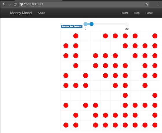
Now run this file; this should launch the interactive visualization server and open your web browser automatically. (If the browser doesn’t open automatically, try pointing it at http://127.0.0.1:8521 manually. If this doesn’t show you the visualization, something may have gone wrong with the server launch.)
You should see something like the figure below: the model title, an empty space where the grid will be, and a control panel off to the right.
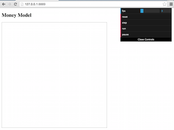
Click the Reset button on the control panel, and you should see the grid fill up with red circles, representing agents.
Click Step to advance the model by one step, and the agents will move around. Click Start and the agents will keep moving around, at the rate set by the ‘fps’ (frames per second) slider at the top. Try moving it around and see how the speed of the model changes. Pressing Stop will pause the model; presing Start again will restart it. Finally, Reset will start a new instantiation of the model.
To stop the visualization server, go back to the terminal where you launched it, and press Control+c.
Changing the agents#
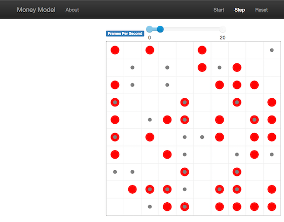
In the visualization above, all we could see is the agents moving around – but not how much money they had, or anything else of interest. Let’s change it so that agents who are broke (wealth 0) are drawn in grey, smaller, and above agents who still have money.
To do this, we go back to our agent_portrayal code and add some code to change the portrayal based on the agent properties and launch the server again.
def agent_portrayal(agent):
    portrayal = {"Shape": "circle", "Filled": "true", "r": 0.5}

    if agent.wealth > 0:
        portrayal["Color"] = "red"
        portrayal["Layer"] = 0
    else:
        portrayal["Color"] = "grey"
        portrayal["Layer"] = 1
        portrayal["r"] = 0.2
    return portrayal
This will open a new browser window pointed at the updated visualization. Initially it looks the same, but advance the model and smaller grey circles start to appear. Note that since the zero-wealth agents have a higher layer number, they are drawn on top of the red agents.
Adding a chart#
Next, let’s add another element to the visualization: a chart, tracking the model’s Gini Coefficient. This is another built-in element that Mesa provides.
The basic chart pulls data from the model’s DataCollector, and draws it as a line graph using the Charts.js JavaScript libraries. We instantiate a chart element with a list of series for the chart to track. Each series is defined in a dictionary, and has a Label (which must match the name of a model-level variable collected by the DataCollector) and a Color name. We can also give the chart the name of the DataCollector object in the model.
Finally, we add the chart to the list of elements in the server. The elements are added to the visualization in the order they appear, so the chart will appear underneath the grid.
chart = mesa.visualization.ChartModule(
    [{"Label": "Gini", "Color": "Black"}], data_collector_name="datacollector"
)

server = mesa.visualization.ModularServer(
    MoneyModel, [grid, chart], "Money Model", {"N": 100, "width": 10, "height": 10}
)
Launch the visualization and start a model run, either by launching the server here or through the full code for source file MoneyModel_Viz.py.
from MoneyModel import mesa, MoneyModel


def agent_portrayal(agent):
    portrayal = {"Shape": "circle", "Filled": "true", "r": 0.5}

    if agent.wealth > 0:
        portrayal["Color"] = "red"
        portrayal["Layer"] = 0
    else:
        portrayal["Color"] = "grey"
        portrayal["Layer"] = 1
        portrayal["r"] = 0.2
    return portrayal


grid = mesa.visualization.CanvasGrid(agent_portrayal, 10, 10, 500, 500)
chart = mesa.visualization.ChartModule(
    [{"Label": "Gini", "Color": "Black"}], data_collector_name="datacollector"
)

server = mesa.visualization.ModularServer(
    MoneyModel, [grid, chart], "Money Model", {"N": 100, "width": 10, "height": 10}
)
server.port = 8521  # The default
server.launch()
You’ll see a line chart underneath the grid. Every step of the model, the line chart updates along with the grid. Reset the model, and the chart resets too.
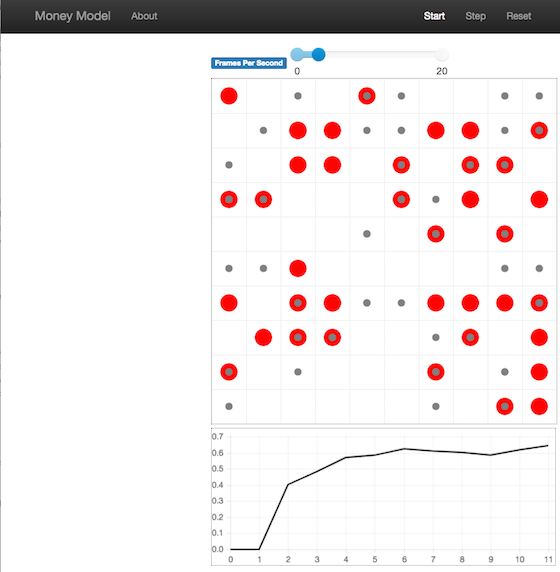
Note: You might notice that the chart line only starts after a couple of steps; this is due to a bug in Charts.js which will hopefully be fixed soon.
Building your own visualization component#
Note: This section is for users who have a basic familiarity with JavaScript. If that’s not you, don’t worry! (If you’re an advanced JavaScript coder and find things that we’ve done wrong or inefficiently, please let us know!)
If the visualization elements provided by Mesa aren’t enough for you, you can build your own and plug them into the model server.
First, you need to understand how the visualization works under the hood. Remember that each visualization module has two sides: a Python object that runs on the server and generates JSON data from the model state (the server side), and a JavaScript object that runs in the browser and turns the JSON into something it renders on the screen (the client side).
Obviously, the two sides of each visualization must be designed in tandem. They result in one Python class, and one JavaScript .js file. The path to the JavaScript file is a property of the Python class.
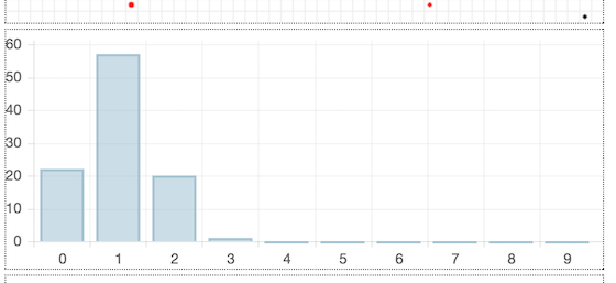
For this example, let’s build a simple histogram visualization, which can count the number of agents with each value of wealth. We’ll use the Charts.js JavaScript library, which is already included with Mesa. If you go and look at its documentation, you’ll see that it had no histogram functionality, which means we have to build our own out of a bar chart. We’ll keep the histogram as simple as possible, giving it a fixed number of integer bins. If you were designing a more general histogram to add to the Mesa repository for everyone to use across different models, obviously you’d want something more general.
Client-Side Code#
In general, the server- and client-side are written in tandem. However, if you’re like me and more comfortable with Python than JavaScript, it makes sense to figure out how to get the JavaScript working first, and then write the Python to be compatible with that.
In the same directory as your model, create a new file called HistogramModule.js. This will store the JavaScript code for the client side of the new module.
JavaScript classes can look alien to people coming from other languages – specifically, they can look like functions. (The Mozilla Introduction to Object-Oriented JavaScript is a good starting point). In HistogramModule.js, start by creating the class itself:
const HistogramModule = function(bins, canvas_width, canvas_height) {
    // The actual code will go here.
};
Note that our object is instantiated with three arguments: the number of integer bins, and the width and height (in pixels) the chart will take up in the visualization window.
When the visualization object is instantiated, the first thing it needs to do is prepare to draw on the current page. To do so, it adds a canvas tag to the page. It also gets the canvas’ context, which is required for doing anything with it.
const HistogramModule = function(bins, canvas_width, canvas_height) {
  // Create the canvas object:
    const canvas = document.createElement("canvas");
    Object.assign(canvas, {
      width: canvas_width,
      height: canvas_height,
      style: "border:1px dotted",
    });
  // Append it to #elements:
  const elements = document.getElementById("elements");
  elements.appendChild(canvas);

  // Create the context and the drawing controller:
  const context = canvas.getContext("2d");
};
Look at the Charts.js bar chart documentation. You’ll see some of the boilerplate needed to get a chart set up. Especially important is the data object, which includes the datasets, labels, and color options. In this case, we want just one dataset (we’ll keep things simple and name it “Data”); it has bins for categories, and the value of each category starts out at zero. Finally, using these boilerplate objects and the canvas context we created, we can create the chart object.
const HistogramModule = function(bins, canvas_width, canvas_height) {
  // Create the canvas object:
    const canvas = document.createElement("canvas");
    Object.assign(canvas, {
      width: canvas_width,
      height: canvas_height,
      style: "border:1px dotted",
    });
  // Append it to #elements:
  const elements = document.getElementById("elements");
  elements.appendChild(canvas);

  // Create the context and the drawing controller:
  const context = canvas.getContext("2d");

  // Prep the chart properties and series:
  const datasets = [{
    label: "Data",
    fillColor: "rgba(151,187,205,0.5)",
    strokeColor: "rgba(151,187,205,0.8)",
    highlightFill: "rgba(151,187,205,0.75)",
    highlightStroke: "rgba(151,187,205,1)",
    data: []
  }];

  // Add a zero value for each bin
  for (var i in bins)
    datasets[0].data.push(0);

  const data = {
    labels: bins,
    datasets: datasets
  };

  const options = {
    scaleBeginsAtZero: true
  };

  // Create the chart object
  let chart = new Chart(context, {type: 'bar', data: data, options: options});

  // Now what?
};
There are two methods every client-side visualization class must implement to be able to work: render(data) to render the incoming data, and reset() which is called to clear the visualization when the user hits the reset button and starts a new model run.
In this case, the easiest way to pass data to the histogram is as an array, one value for each bin. We can then just loop over the array and update the values in the chart’s dataset.
There are a few ways to reset the chart, but the easiest is probably to destroy it and create a new chart object in its place.
With that in mind, we can add these two methods to the class:
const HistogramModule = function(bins, canvas_width, canvas_height) {
  // ...Everything from above...
  this.render = function(data) {
    datasets[0].data = data;
    chart.update();
  };

  this.reset = function() {
    chart.destroy();
    chart = new Chart(context, {type: 'bar', data: data, options: options});
  };
};
Note the this. before the method names. This makes them public and ensures that they are accessible outside of the object itself. All the other variables inside the class are only accessible inside the object itself, but not outside of it.
Server-Side Code#
Can we get back to Python code? Please?
Every JavaScript visualization element has an equal and opposite server-side Python element. The Python class needs to also have a render method, to get data out of the model object and into a JSON-ready format. It also needs to point towards the code where the relevant JavaScript lives, and add the JavaScript object to the model page.
In a Python file (either its own, or in the same file as your visualization code), import the VisualizationElement class we’ll inherit from, and create the new visualization class.
    from mesa.visualization.ModularVisualization import VisualizationElement, CHART_JS_FILE

    class HistogramModule(VisualizationElement):
        package_includes = [CHART_JS_FILE]
        local_includes = ["HistogramModule.js"]

        def __init__(self, bins, canvas_height, canvas_width):
            self.canvas_height = canvas_height
            self.canvas_width = canvas_width
            self.bins = bins
            new_element = "new HistogramModule({}, {}, {})"
            new_element = new_element.format(bins,
                                             canvas_width,
                                             canvas_height)
            self.js_code = "elements.push(" + new_element + ");"
There are a few things going on here. package_includes is a list of JavaScript files that are part of Mesa itself that the visualization element relies on. You can see the included files in mesa/visualization/templates/. Similarly, local_includes is a list of JavaScript files in the same directory as the class code itself. Note that both of these are class variables, not object variables – they hold for all particular objects.
Next, look at the __init__ method. It takes three arguments: the number of bins, and the width and height for the histogram. It then uses these values to populate the js_code property; this is code that the server will insert into the visualization page, which will run when the page loads. In this case, it creates a new HistogramModule (the class we created in JavaScript in the step above) with the desired bins, width and height; it then appends (pushes) this object to elements, the list of visualization elements that the visualization page itself maintains.
Now, the last thing we need is the render method. If we were making a general-purpose visualization module we’d want this to be more general, but in this case we can hard-code it to our model.
import numpy as np

class HistogramModule(VisualizationElement):
    # ... Everything from above...

    def render(self, model):
        wealth_vals = [agent.wealth for agent in model.schedule.agents]
        hist = np.histogram(wealth_vals, bins=self.bins)[0]
        return [int(x) for x in hist]
Every time the render method is called (with a model object as the argument) it uses numpy to generate counts of agents with each wealth value in the bins, and then returns a list of these values. Note that the render method doesn’t return a JSON string – just an object that can be turned into JSON, in this case a Python list (with Python integers as the values; the json library doesn’t like dealing with numpy’s integer type).
Now, you can create your new HistogramModule and add it to the server:
    histogram = mesa.visualization.HistogramModule(list(range(10)), 200, 500)
    server = mesa.visualization.ModularServer(MoneyModel,
                           [grid, histogram, chart],
                           "Money Model",
                           {"N":100, "width":10, "height":10})
    server.launch()
Run this code, and you should see your brand-new histogram added to the visualization and updating along with the model!
If you’ve felt comfortable with this section, it might be instructive to read the code for the ModularServer and the modular_template to get a better idea of how all the pieces fit together.
Happy Modeling!#
This document is a work in progress. If you see any errors, exclusions or have any problems please contact us.